
01 /
Morpho
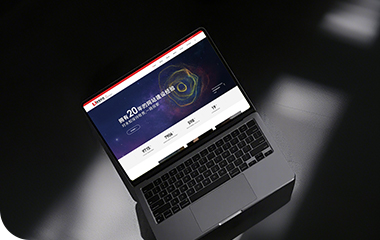
Morpho 网页采用深蓝与暗灰色系构建整体基调,辅以流动的3D图形与高光玻璃质感,让整个产品呈现出 “机构级理性”的设计感,避免了传统金融中频繁出现的压迫元素。
图形与交互辅助解释了原本高度抽象的 DeFi 概念(如 peer-to-peer matching、Morpho Blue 的结构等),为非技术用户降低了理解门槛,这与其在 DeFi 生态中扮演的 “协议层技术中介” 的角色高度一致。
The Morpho website uses a deep blue and dark gray color scheme to create an overall tone, complemented by flowing 3D graphics and a glossy, high-light glass texture. This gives the entire product a "institutional-level rationality" feelling, avoiding the oppressive elements often found in traditional finance.
The graphics and interactions help explain originally highly abstract DeFi concepts (such as peer-to-peer matching, the structure of Morpho Blue, etc.), lowering the understanding threshold for non-technical users. This is highly consistent with its role as a "protocol-layer technology intermediary" in the DeFi ecosystem.
无论在高分辨率显示器还是移动设备上,Morpho 都保持了良好的视觉一致性和交互流畅性,微动效与加载动画都被严格控制在极简节奏内。
我们关注的不仅仅是表层的 UI,也并未选择 overly futuristic(过度未来感)或 meme-driven 的视觉风格,而是去理解算法与信任协议的本质,避开了复杂逻辑,纯粹以设计去介入叙事。
Morpho maintains good visual consistency and smooth interaction on both high-resolution displays and mobile devices, with micro-animations and loading sequences strictly controlled within a minimalist rhythm.
Our focus is not only the surface-level of UI, nor have we chosen an overly futuristic or meme-driven visual style. Instead, we aim to understand the essence of algorithms and trust protocols, avoiding complex logic and purely using design to engage with the narrative.
PROJECT
02 /
Cosmos
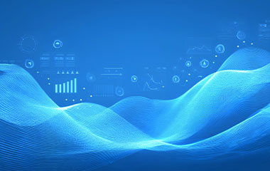
Cosmos 官网以宇宙为隐喻,以模块为语法,用一套极具系统感的视觉语言,展现其“区块链互联网”的宏大愿景。
其中主色调取深蓝+星云紫,打造出开放、深邃的“宇宙空间感”,动效柔和,信息模块像星球般浮动而独立,隐喻“主链+Zone”架构下的多链生态。
The website of Cosmos uses the universe as a metaphor and modules as grammar, employing a visually coherent system to showcase its grand vision of an "Internet of Blockchains".
Dominated by deep blue and nebula purple, the site creates an open and profound "cosmic space feeling". With gentle animations, information modules float independently like planets, symbolizing the Multi-chain ecosystem under the architecture of "Main Chain + Zones".
整个信息架构我们以 “Build”、“Explore”、“Interchain Stack”为主轴,面向不同群体(开发者/研究者/生态观察者)分层展示,甲方要求的内容密度虽高,但由于编排有序,也减轻了空间上的压迫感。
The entire information architecture is centered around the themes of "Build", "Explore", and "Interchain Stack", presenting content in a layered manner tailored to different audiences (developers/researchers/ecosystem observers).
Although the content density required by Party A is high, the meticulous arrangement helps alleviate the sense of spatial oppression.
PROJECT
03 /
Shardeum
Shardeum 作为主打线性可扩展性(线性分片)的 EVM Layer 1,其官网视觉设计主要体现 “扩展、秩序、模块化”。
该项目中,采用大量不规则图形插画+鲜明的品牌色来解构网页,主视觉突出,以品牌色调深夜蓝+霓虹渐变为主,整体层次分明、简单,与绝大多数Web3项目风格不同的是,Shardeum全站的矢量元素皆由illustrator创造。
As an EVM Layer 1 focused on linear scalability (linear sharding), the visual design of the Shardeum website primarily embodies the concepts of "expansion, order, and modularity".
In this project, a plethora of irregular graphic illustrations combined with vibrant brand colors are used to deconstruct the page. The main visual elements stand out prominently, featuring brand colors of midnight blue and neon gradients.
The overall layout is well-layered and straightforward. Unlike the majority of Web3 projects, all vector elements across Shardeum's site are created using Illustrator.
滑动节奏控制合理,尤其在“how it works” “why scalable” 等技术信息段落中,通过动效层层推进,帮助用户逐步理解其分片逻辑与性能优势,减少技术术语带来的理解负担。
从品牌策略看设计选择:Builder-Friendly + Infra-Level 信任感,目的是对开发者友好、结构清晰、利于内容传播,符合该印度团队希望向全球开发者开放的可扩展底层链的品牌叙事。
The scrolling rhythm is well-controlled, especially in technical information sections such as "How It Works" and "Why Scalable". Through sequential animations, the website helps users gradually understand Shardeum's sharding logic and advantages of performance, thereby reducing the cognitive load imposed by technical jargon.
From a brand perspective, the design choices a "Builder-Friendly + Infra-Level" trust-building approach. The goal is to be developer-friendly, with a clear structure that facilitates content dissemination.
This aligns with the Indian team's brand narrative of offering an open, scalable base chain to developers worldwide. These design decisions not only enhance user comprehension but also reinforce the project’s reliability and accessibility on an infrastructural level.
优网科技秉承"专业团队、品质服务" 的经营理念,诚信务实的服务了近万家客户,成为众多世界500强、集团和上市公司的长期合作伙伴!
优网科技成立于2001年,擅长网站建设、网站与各类业务系统深度整合,致力于提供完善的企业互联网解决方案。优网科技提供PC端网站建设(品牌展示型、官方门户型、营销商务型、电子商务型、信息门户型、微信小程序定制开发、移动端应用(手机站、APP开发)、微信定制开发(微信官网、微信商城、企业微信)等一系列互联网应用服务。
 公安局备案号: