发现CSS 还超好看的
——立体效果靠box-shadow双层叠加实现:
外层: 5px 5px 8px #babebc(暗影) +-5px -5px 10px #fff(高光)内层(如输入框): inset 7px 2px 10px #babebc, inset -5px -5px 12px #fff
配合border-radius、transform: translateX()动画与:active压感反馈,让按钮、卡片、输入框跃然屏上,兼具质感与交互呼吸感。
<template>
    <div class="wrapper">
        <div class="container" :class="{ 'right-panel-active': isRightPanelActive }">
            <!-- 注册表单 -->
            <div class="sign-up-container">
                <form @submit.prevent>
                    <h1>创建账号</h1>
                    <div class="social-links">
                        <div>
                            <a href="#"><i class="fa fa-facebook" aria-hidden="true"></i></a>
                        </div>
                        <div>
                            <a href="#"><i class="fa fa-twitter" aria-hidden="true"></i></a>
                        </div>
                        <div>
                            <a href="#"><i class="fa fa-linkedin" aria-hidden="true"></i></a>
                        </div>
                    </div>
                    <span>或者使用您的邮箱</span>
                    <input type="text" placeholder="登录名" v-model="signupForm.username">
                    <input type="email" placeholder="Email" v-model="signupForm.email">
                    <input type="password" placeholder="密码" v-model="signupForm.password">
                    <button class="form_btn" @click="handleSignup">注册</button>
                </form>
            </div>

            <!-- 登录表单 -->
            <div class="sign-in-container">
                <form @submit.prevent>
                    <h1>登录</h1>
                    <div class="social-links">
                        <div>
                            <a href="#"><i class="fa fa-facebook" aria-hidden="true"></i></a>
                        </div>
                        <div>
                            <a href="#"><i class="fa fa-twitter" aria-hidden="true"></i></a>
                        </div>
                        <div>
                            <a href="#"><i class="fa fa-linkedin" aria-hidden="true"></i></a>
                        </div>
                    </div>
                    <span>或者使用你的账号</span>
                    <input type="email" placeholder="Email" v-model="loginForm.email">
                    <input type="password" placeholder="密码" v-model="loginForm.password">
                    <button class="form_btn" @click="handleLogin">登录</button>
                </form>
            </div>

            <!-- 切换面板 -->
            <div class="overlay-container">
                <div class="overlay-left">
                    <h1>欢迎回来</h1>
                    <p>To keep connected with us please login with your personal info</p>
                    <button id="signIn" class="overlay_btn" @click="switchToLogin">登录</button>
                </div>
                <div class="overlay-right">
                    <h1>Hello!👋 朋友</h1>
                    <p>Enter your personal details and start journey with us</p>
                    <button id="signUp" class="overlay_btn" @click="switchToSignup">注册</button>
                </div>
            </div>
        </div>
    </div>
</template>

<script setup>
import { ref } from 'vue'

// 控制面板显示状态
const isRightPanelActive = ref(false)

// 注册表单数据
const signupForm = ref({
    username: '',
    email: '',
    password: ''
})

// 登录表单数据
const loginForm = ref({
    email: '',
    password: ''
})

// 切换到注册面板
const switchToSignup = () => {
    isRightPanelActive.value = true
}

// 切换到登录面板
const switchToLogin = () => {
    isRightPanelActive.value = false
}

// 登录处理函数
const handleLogin = () => {
    console.log('登录信息:', loginForm.value)
    // 这里可以添加登录逻辑,比如调用API
    // 示例:if (登录成功) { ... }
}

// 注册处理函数
const handleSignup = () => {
    console.log('注册信息:', signupForm.value)
    // 这里可以添加注册逻辑,比如调用API
    // 示例:if (注册成功) { ... }
}
</script>

<style scoped>
/* 引入Font Awesome图标库 */
@import url("https://cdnjs.cloudflare.com/ajax/libs/font-awesome/4.7.0/css/font-awesome.css");

* {
    box-sizing: border-box;
}

body {
    font-family: "Montserrat", sans-serif;
    margin: 0;
    padding: 0;
}

.wrapper {
    width: 100%;
    height: 100vh;
    display: flex;
    justify-content: center;
    align-items: center;
    background: linear-gradient(145deg, #e8eaef 0%, #dde0e6 100%);
    overflow: hidden;
}

.container {
    border-radius: 10px;
    box-shadow: -5px -5px 10px #f8f9fc, 5px 5px 10px #c2c6ce;
    position: absolute;
    width: 768px;
    min-height: 480px;
    overflow: hidden;
}

form {
    background: #e4e6ec;
    display: flex;
    flex-direction: column;
    padding: 0 50px;
    height: 100%;
    justify-content: center;
    align-items: center;
}

form input {
    background: #e4e6ec;
    padding: 16px;
    margin: 8px 0;
    width: 85%;
    border: 0;
    outline: none;
    border-radius: 20px;
    box-shadow: inset 7px 2px 10px #c2c6ce, inset -5px -5px 12px #f8f9fc;
}

button {
    border-radius: 20px;
    border: none;
    outline: none;
    font-size: 12px;
    font-weight: bold;
    padding: 15px 45px;
    margin: 14px;
    letter-spacing: 1px;
    text-transform: uppercase;
    cursor: pointer;
    transition: transform 80ms ease-in;
}

.form_btn {
    box-shadow: -5px -5px 10px #f8f9fc, 5px 5px 8px #c2c6ce;
    color: #334155;
}

.form_btn:active {
    box-shadow: inset 1px 1px 2px #c2c6ce, inset -1px -1px 2px #f8f9fc;
}

.overlay_btn {
    background: linear-gradient(135deg, #0d9488 0%, #0f766e 100%);
    color: #fff;
    box-shadow: -5px -5px 10px #2dd4bf, 5px 5px 8px #0f766e;
}

.sign-in-container {
    position: absolute;
    left: 0;
    width: 50%;
    height: 100%;
    transition: all 0.5s;
}

.sign-up-container {
    position: absolute;
    left: 0;
    width: 50%;
    height: 100%;
    opacity: 0;
    transition: all 0.5s;
}

.overlay-left {
    display: flex;
    flex-direction: column;
    padding: 0 50px;
    justify-content: center;
    align-items: center;
    position: absolute;
    right: 0;
    width: 50%;
    height: 100%;
    opacity: 0;
    background: linear-gradient(135deg, #0d9488 0%, #0f766e 100%);
    color: #fff;
    transition: all 0.5s;
}

.overlay-right {
    display: flex;
    flex-direction: column;
    padding: 0 50px;
    justify-content: center;
    align-items: center;
    position: absolute;
    right: 0;
    width: 50%;
    height: 100%;
    background: linear-gradient(135deg, #0d9488 0%, #0f766e 100%);
    color: #fff;
    transition: all 0.5s;
}

.container.right-panel-active .sign-in-container {
    transform: translateX(100%);
    opacity: 0;
}

.container.right-panel-active .sign-up-container {
    transform: translateX(100%);
    opacity: 1;
    z-index: 2;
}

.container.right-panel-active .overlay-right {
    transform: translateX(-100%);
    opacity: 0;
}

.container.right-panel-active .overlay-left {
    transform: translateX(-100%);
    opacity: 1;
    z-index: 2;
}

.social-links {
    margin: 20px 0;
}

form h1 {
    font-weight: bold;
    margin: 0;
    color: #1e293b;
}

p {
    font-size: 16px;
    font-weight: bold;
    letter-spacing: 0.5px;
    margin: 20px 0 30px;
    color: rgba(255, 255, 255, 0.95);
}

.overlay-left p,
.overlay-right p {
    color: rgba(255, 255, 255, 0.9);
}

span {
    font-size: 12px;
    color: #475569;
    letter-spacing: 0.5px;
    margin-bottom: 10px;
}

.social-links div {
    width: 40px;
    height: 40px;
    display: inline-flex;
    justify-content: center;
    align-items: center;
    margin: 0 5px;
    border-radius: 50%;
    box-shadow: -5px -5px 10px #f8f9fc, 5px 5px 8px #c2c6ce;
    cursor: pointer;
}

.social-links a {
    color: #475569;
}

.social-links div:active {
    box-shadow: inset 1px 1px 2px #c2c6ce, inset -1px -1px 2px #f8f9fc;
}
</style>
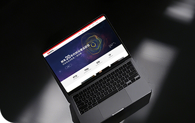
本文介绍了一种利用 CSS box-shadow 实现立体质感的 UI 设计技巧:通过双层(外层+内层)阴影叠加模拟明暗对比,外层使用 5px 5px 8px #babebc 与 -5px -5px 10px #fff 构建按钮/卡片的浮雕效果;内层 inset 阴影增强输入框的凹陷感。配合 border-radius 圆角、transform: translateX() 动画实现左右表单切换,以及 :active 状态下的压感反馈,显著提升交互的“呼吸感”与视觉层次。代码以 Vue 3 组合式 API 实现登录/注册双面板切换,样式采用渐变背景、图标社交链接与响应式布局,整体兼顾美观性、可用性与现代 CSS 实践。
总结:
前端路上 | 所知甚少,唯善学。
各位小伙伴有什么疑问,欢迎留言探讨。
--- ✨关注我:前端路上不迷路 ---
优网科技,优秀企业首选的互联网供应服务商
优网科技秉承"专业团队、品质服务" 的经营理念,诚信务实的服务了近万家客户,成为众多世界500强、集团和上市公司的长期合作伙伴!
优网科技成立于2001年,擅长网站建设、网站与各类业务系统深度整合,致力于提供完善的企业互联网解决方案。优网科技提供PC端网站建设(品牌展示型、官方门户型、营销商务型、电子商务型、信息门户型、微信小程序定制开发、移动端应用(手机站、APP开发)、微信定制开发(微信官网、微信商城、企业微信)等一系列互联网应用服务。


 公安局备案号:
 专属顾问
专属顾问