


前言
作为前端开发者,CSS动画是我们必须掌握的核心技能。本文将系统介绍CSS动画的6种基础类型,包括位移(translate)、缩放(scale)、旋转(rotate)、尺寸变化(width/height)、背景/颜色变化(background/color)和透明度(opacity)。通过组合这些基础动画,我们可以创造出丰富多样的交互效果。
1. CSS基本动画的6种基础类型
| 位移 | transform: translate | |
| 缩放 | transform: scale | |
| 旋转 | transform: rotate | |
| 尺寸变化 | widthheight | |
| 背景变化 | backgroundcolor | |
| 淡入淡出 | opacity |
效果展示:
2. 案例说明
2.1 位移(translate)
作用:让元素在X轴、Y轴或Z轴方向上移动。
<!-- 位移动画 -->
<divclass="demo-container">
    <h2class="demo-title">位移动画 (translate)</h2>
    <divclass="animation-box translate-box">移动</div>
    <p>使用 transform: translateX/Y 实现元素位置移动</p>
</div>

<style>
body {
    display: grid;
    grid-template-columns: repeat(2, 1fr);
    gap: 20px;
    padding: 20px;
    background-color: #f5f5f5;
}

.demo-container {
    background: white;
    border-radius: 8px;
    padding: 15px;
    box-shadow: 02px5pxrgba(0,0,0,0.1);
}

.demo-title {
    color: #333;
    margin-top: 0;
    border-bottom: 1px solid #eee;
    padding-bottom: 10px;
}

.animation-box {
    width: 100px;
    height: 100px;
    margin: 20px auto;
    background-color: #3498db;
    display: flex;
    justify-content: center;
    align-items: center;
    color: white;
    font-weight: bold;
}

/* 位移动画 */
.translate-box {
    animation: slideIn 2s infinite alternate;
}

@keyframes slideIn {
    0% { transform: translateX(-100px); }
    100% { transform: translateX(100px); }
}
</style>
效果说明:元素在水平方向上来回滑动,从左侧-100px位置移动到右侧100px位置。alternate属性使动画往返播放,infinite让动画无限循环。
2.2 缩放(scale)
作用:放大或缩小元素尺寸。
<!-- 缩放动画 -->
<divclass="demo-container">
    <h2class="demo-title">缩放动画 (scale)</h2>
    <divclass="animation-box scale-box">缩放</div>
    <p>使用 transform: scale() 实现元素大小缩放</p>
</div>

<style>
/* 缩放动画 */
.scale-box {
    animation: scale 2s infinite alternate;
}

@keyframes scale {
    0% { transform: scale(0.5); }
    100% { transform: scale(1.5); }
}
</style>
效果说明:红色方块会在0.5倍到1.5倍大小之间循环缩放。常用于强调重要元素或创建呼吸效果。
2.3 尺寸变化(resize)
作用:直接改变元素的宽度或高度。
<!-- 尺寸变化 -->
<divclass="demo-container">
    <h2class="demo-title">尺寸变化 (resize)</h2>
    <divclass="animation-box resize-box">尺寸</div>
    <p>使用 width/height 属性实现元素尺寸变化</p>
</div>

<style>
/* 尺寸变化 */
.resize-box {
    animation: expand 2s infinite alternate;
}

@keyframes expand {
    0% { width: 50px; height: 50px; }
    100% { width: 150px; height: 150px; }
}
</style>
效果说明:方块宽度从50px扩展到150px,高度从50px收缩到150px。
2.4 旋转(rotate)
作用:使元素绕中心点旋转。
<!-- 旋转动画 -->
<divclass="demo-container">
    <h2class="demo-title">旋转动画 (rotate)</h2>
    <divclass="animation-box rotate-box">旋转</div>
    <p>使用 transform: rotate() 实现元素旋转效果</p>
</div>

<style>
/* 旋转动画 */
.rotate-box {
    animation: spin 2s infinite linear;
}

@keyframes spin {
    0% { transform: rotate(0deg); }
    100% { transform: rotate(360deg); }
}
</style>
效果说明:方块会以线性速度无限旋转360度。常用于加载指示器或刷新按钮。
2.5 背景变化(background)
作用:改变元素的背景色或背景图。
<!-- 背景变化 -->
<divclass="demo-container">
    <h2class="demo-title">背景变化 (background)</h2>
    <divclass="animation-box background-box">背景</div>
    <p>使用 background-color 实现背景颜色渐变</p>
</div>

<style>
/* 背景变化 */
.background-box {
    animation: colorChange 2s infinite alternate;
}

@keyframes colorChange {
    0% { background-color: #3498db; }
    100% { background-color: #e74c3c; }
}
</style>
效果说明:方块背景色元素的背景色从蓝色平滑过渡到红色。适合用于状态变化提示。
2.6 淡入淡出(fade)
作用:通过透明度变化实现元素的显现或消失。
<!-- 淡入淡出 -->
<divclass="demo-container">
    <h2class="demo-title">淡入淡出 (fade)</h2>
    <divclass="animation-box fade-box">淡入淡出</div>
    <p>使用 opacity 实现元素的淡入淡出效果</p>
</div>

<style>
/* 淡入淡出 */
.fade-box {
    animation: fadeInOut 3s infinite;
}

@keyframes fadeInOut {
    0% { opacity: 0; }
    50% { opacity: 1; }
    100% { opacity: 0; }
}
</style>
效果说明:深方块会逐渐显现再消失,实现淡入淡出效果。常用于模态框或提示信息的显示隐藏。
总结
最后总结一下,掌握这6种CSS基础动画类型,能应对大多数常见的动效需求。在实际项目中,根据具体场景选择合适的动画类型和组合方式。
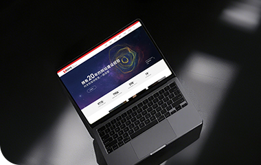
优网科技秉承"专业团队、品质服务" 的经营理念,诚信务实的服务了近万家客户,成为众多世界500强、集团和上市公司的长期合作伙伴!
优网科技成立于2001年,擅长网站建设、网站与各类业务系统深度整合,致力于提供完善的企业互联网解决方案。优网科技提供PC端网站建设(品牌展示型、官方门户型、营销商务型、电子商务型、信息门户型、微信小程序定制开发、移动端应用(手机站、APP开发)、微信定制开发(微信官网、微信商城、企业微信)等一系列互联网应用服务。


 公安局备案号:
 专属顾问
专属顾问