扁平化设计当道的今天,拟物风格却总能带来独特的视觉温度。今天我们用纯CSS还原一个超逼真的耳机充电盒,光影、材质、呼吸灯一应俱全,带你感受代码与设计的浪漫碰撞!
效果
拟物美学三大核心技法
✨立体感雕刻术:内阴影叠加
.box-shadow {
    inset0px35px25px#ffffffe0,  /* 顶部高光 */
    inset10px0px25px#0000004b,  /* 左侧暗部 */
    inset40px0px20px#ffffff,    /* 左侧边缘反光 */
    ...                             /* 共7层阴影! */
}通过多层内阴影叠加,模拟出金属边缘的折射光、侧面的磨砂反光,甚至底部的环境遮蔽效果。
✨材质魔法:渐变+圆角
.cavity {
    background: linear-gradient(180deg, #d6d6d6, #fff);
    border-radius: 200px; /* 超椭圆弧度 */
}线性渐变营造明暗过渡,200px的超大圆角形成完美的曲面弧度,仿佛能触摸到真实的金属凹槽。
✨灵魂之眼:呼吸灯动画
@keyframes colorChange {
    0% { background-color: #ff0000; }  /* 红 */
    50% { background-color: #00ff00; } /* 绿 */
    100% { background-color: #ff0000; }
}通过关键帧动画实现红绿渐变,搭配box-shadow发光效果,瞬间赋予设备「生命感」。
HTML
<!DOCTYPE html>
<htmllang="en">

<head>
    <metacharset="UTF-8">
    <metaname="viewport"content="width=device-width, initial-scale=1.0">
    <title>拟物耳机盒效果</title>
    <linkrel="stylesheet"href="./css/index.css">
</head>

<body>
    <!-- 主要卡片容器 -->
    <divclass="card">
        <!-- 凹槽结构 -->
        <divclass="lc cavity"></div>
        <!-- 中心分割线 -->
        <divclass="lc line"></div>
        <!-- LED指示灯 -->
        <divclass="led"></div>
        <divclass="text">Hello World!</div>
    </div>
</body>

</html>
CSS
* {
    margin: 0;
    padding: 0;
}

body {
    display: flex;
    align-items: center;
    justify-content: center;
    height: 100vh;
    background-color: #eee;
}

.card {
    width: 270px;
    height: 220px;
    background-color: #e9e9e9;
    border-radius: 70px;
    box-shadow:
        inset 0px35px25px#ffffffe0,
        inset 10px0px25px#0000004b,
        inset 40px0px20px#ffffff,
        inset -10px0px25px#0000004b,
        inset -40px0px20px#fff,
        inset 0px10px10px#000000e0,
        inset 0px -15px25px#00000036,
        10px25px40px -10px#00000060;
    position: relative;
}

.card.line {
    width: 100%;
    height: 2px;
    background-color: #bbb;
    margin-top: 30%;
    position: relative;
}

.line::after,
.line::before {
    content: "";
    position: absolute;
    width: 5%;
    height: 2px;
    background-color: #fff;
}

.line::before {
    right: 0;
}

.card.cavity {
    width: 150px;
    height: 20px;
    background: linear-gradient(180deg, #d6d6d6, #fff);
    border-radius: 200px;
    margin: auto;
    position: absolute;
    top: 30%;
    left: 50%;
    transform: translate(-50%, 30%);
}

.card.led {
    width: 7px;
    aspect-ratio: 1;
    background-color: #00ff00;
    position: absolute;
    top: 50%;
    left: 50%;
    transform: translate(-50%, 30%);
    border-radius: 100px;
    box-shadow: 006px#00ff00;
    animation: colorChange 2s ease-in-out infinite;
}

.card.text {
    text-align: center;
    margin-top: 70px;
    color: #00000036;
    font-weight: bolder;
}

@keyframes colorChange {
    0% {
        background-color: #ff0000;
        box-shadow: 006px#ff0000;
    }
    50% {
        background-color: #00ff00;
        box-shadow: 006px#00ff00;
    }
    100% {
        background-color: #ff0000;
        box-shadow: 006px#ff0000;
    }
}
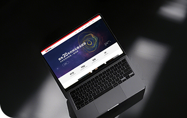
优网科技,优秀企业首选的互联网供应服务商
优网科技秉承"专业团队、品质服务" 的经营理念,诚信务实的服务了近万家客户,成为众多世界500强、集团和上市公司的长期合作伙伴!
优网科技成立于2001年,擅长网站建设、网站与各类业务系统深度整合,致力于提供完善的企业互联网解决方案。优网科技提供PC端网站建设(品牌展示型、官方门户型、营销商务型、电子商务型、信息门户型、微信小程序定制开发、移动端应用(手机站、APP开发)、微信定制开发(微信官网、微信商城、企业微信)等一系列互联网应用服务。
 公安局备案号:
 专属顾问
专属顾问