项目背景
Project Background
萝岗区图书馆位于广州经济技术开发区西区,前身是成立于1987年的广州经济技术开发区图书资料中心。2006年6月正式更名为萝岗区图书馆。现有馆藏图书18万册,年新增图书2万多册,订阅报纸200多种、杂志900余种我馆除开展书刊外借、阅览服务外,还将进一步开展电子阅览、地方文献征集整理以及举办讲座、培训、展览、学术交流、读者沙龙等活动。萝岗区图书馆是公众学习、休闲、交流、研究的理想场所。
Luogang District Library is located in the Guangzhou Economic Development Zone, Western technology, formerly established in 1987 in Guangzhou Economic and Technological Development Zone in the center of books and materials. June 2006 officially changed its name to Luogang District Library. Existing collection of 180,000 books, over 20,000 copies of new books, 200 kinds of subscriptions to newspapers, magazines and more than 900 kinds of books borrowed addition to carrying out our library, reading services, will further develop electronic access, Local Documents Collection finishing as well as seminars, training, exhibitions, academic exchanges, readers salon and other activities. Luogang District Library is an ideal place for the public to learn, leisure, communication, research.
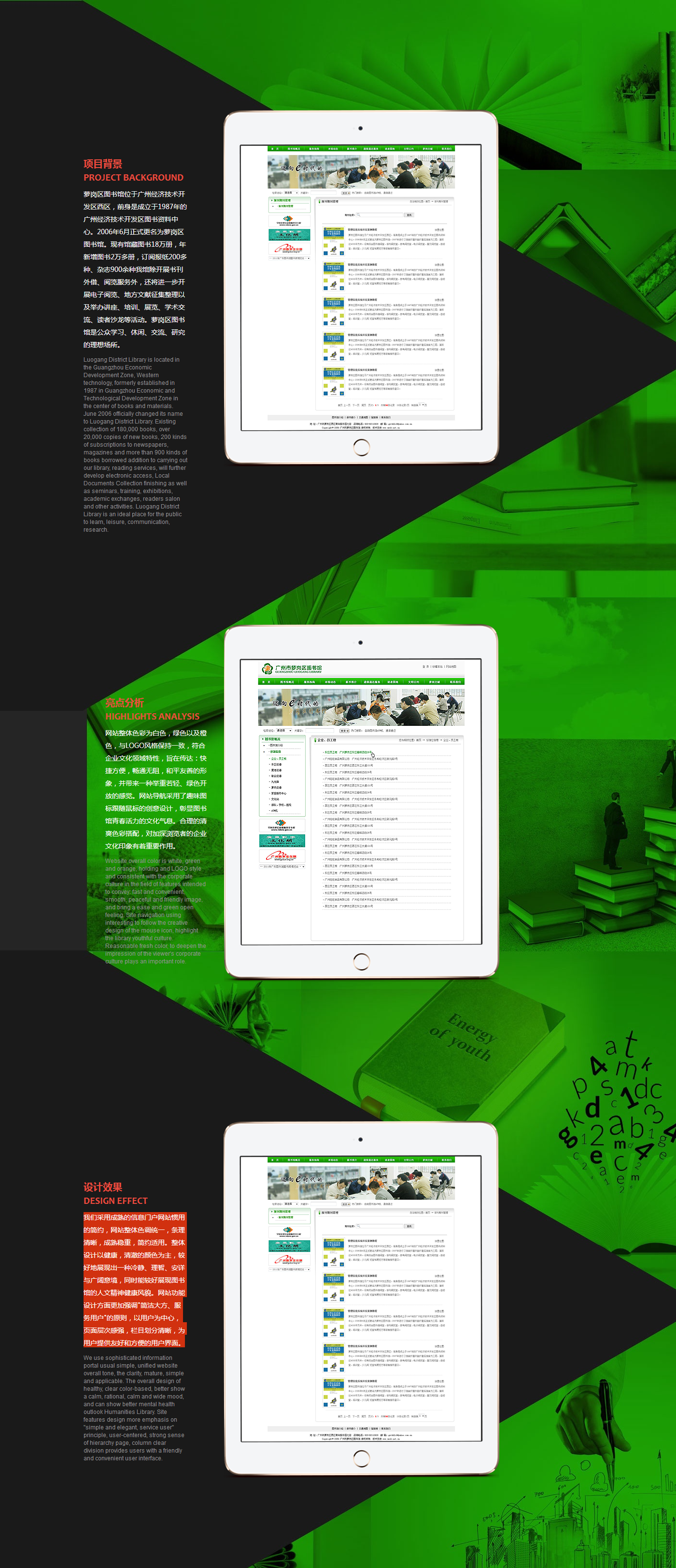
亮点分析
Highlights analysis
网站整体色彩为白色,绿色以及橙色,与LOGO风格保持一致,符合企业文化领域特性,旨在传达:快捷方便,畅通无阻,和平友善的形象,并带来一种举重若轻、绿色开放的感觉。网站导航采用了趣味图标跟随鼠标的创意设计,彰显图书馆青春活力的文化气息。合理的清爽色彩搭配,对加深浏览者的企业文化印象有着重要作用。
Website overall color is white, green and orange, holding and LOGO style and consistent with the corporate culture in the field of features intended to convey: fast and convenient, smooth, peaceful and friendly image, and bring a ease and green open feeling. Site navigation using interesting to follow the creative design of the mouse icon, highlight the library youthful culture. Reasonable fresh color, to deepen the impression of the viewer's corporate culture plays an important role.


 公安局备案号: